
Let’s face it: standard alarm apps suck. Sure, they do eventually get you up in the morning, but only after hitting the snooze button around five times. What’s worst is that, by your sixth snooze, you’re probably still in bed! I’m guessing that you’ve tried downloading one of those apps that ask you to ‘solve a ridiculously simple mathematical equation’ to turn the alarm off. Those apps suck, too.
Say hello (and good morning) to WakeyWakey.
That was a ultra brief snippet from a pitch I made in my final year at University. Let me give this some more context.
Around the start of 2023,
 Prof. Ġorġ Mallia
(a lecturer who has left an indelible mark on me) tasked the class with the most liberal rubric imaginable:
create a brand identity for a new company that produces a new product. You decide what the company is, and what product it sells.
Here’s how I chose to tackle it:
Prof. Ġorġ Mallia
(a lecturer who has left an indelible mark on me) tasked the class with the most liberal rubric imaginable:
create a brand identity for a new company that produces a new product. You decide what the company is, and what product it sells.
Here’s how I chose to tackle it:
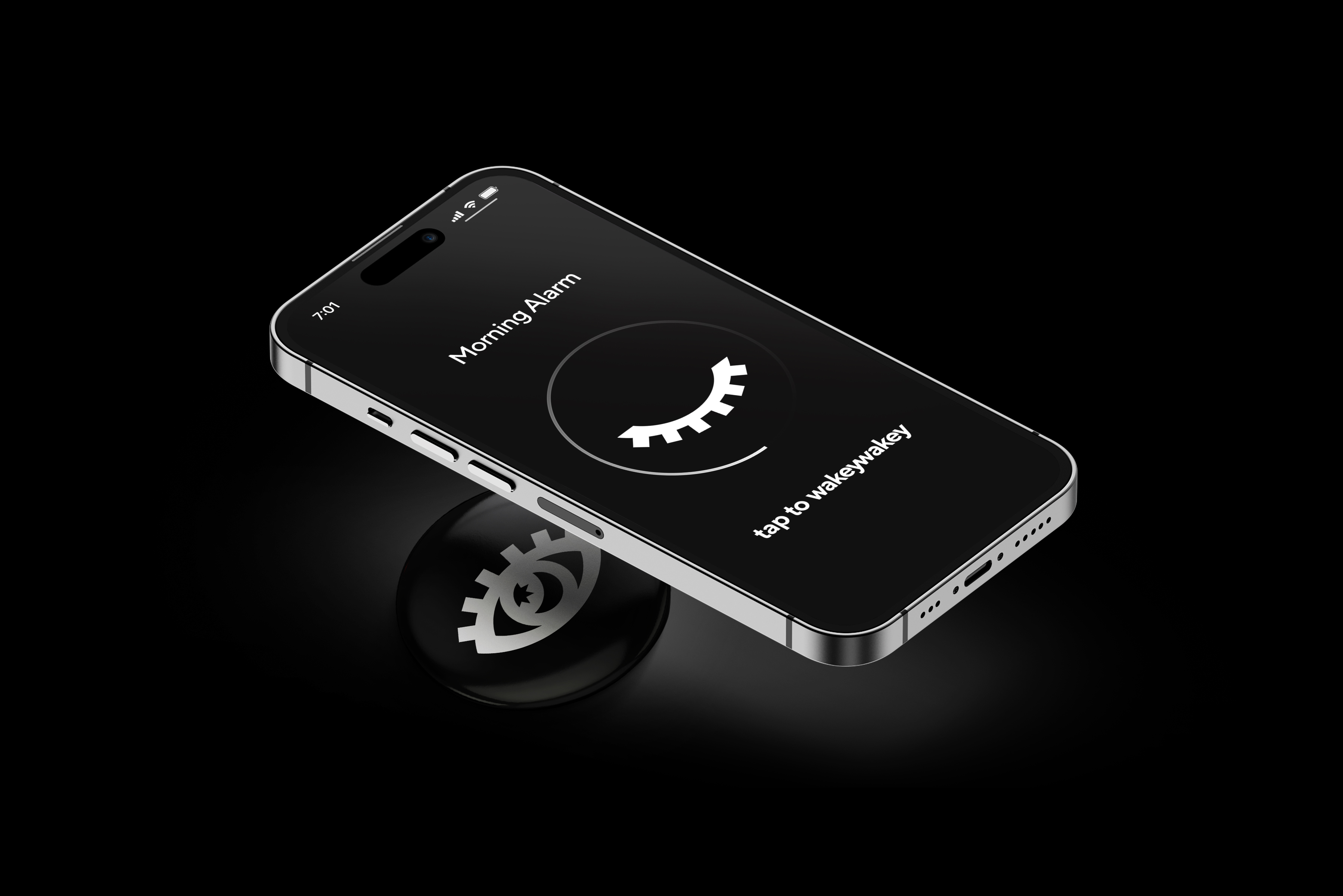
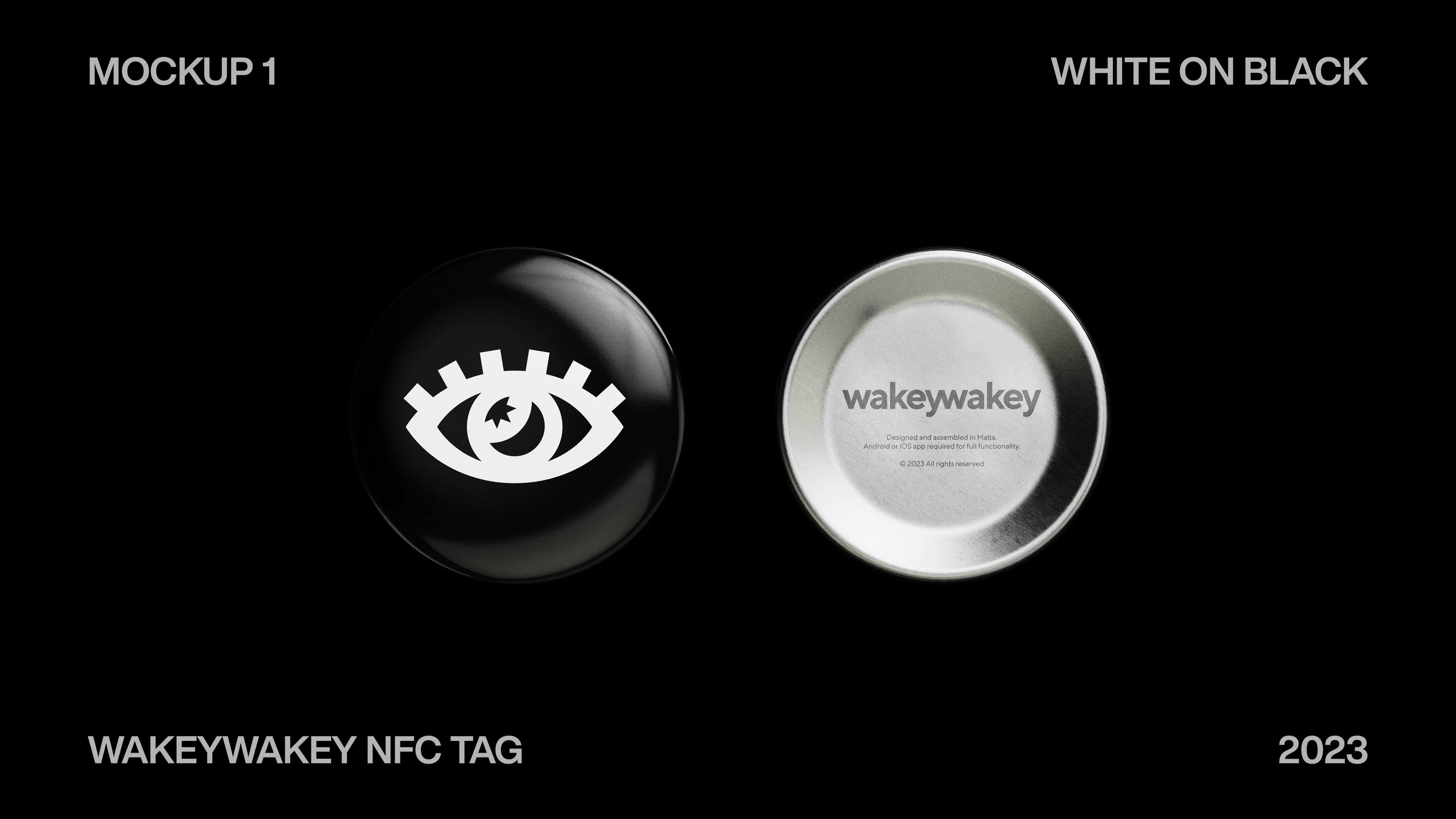
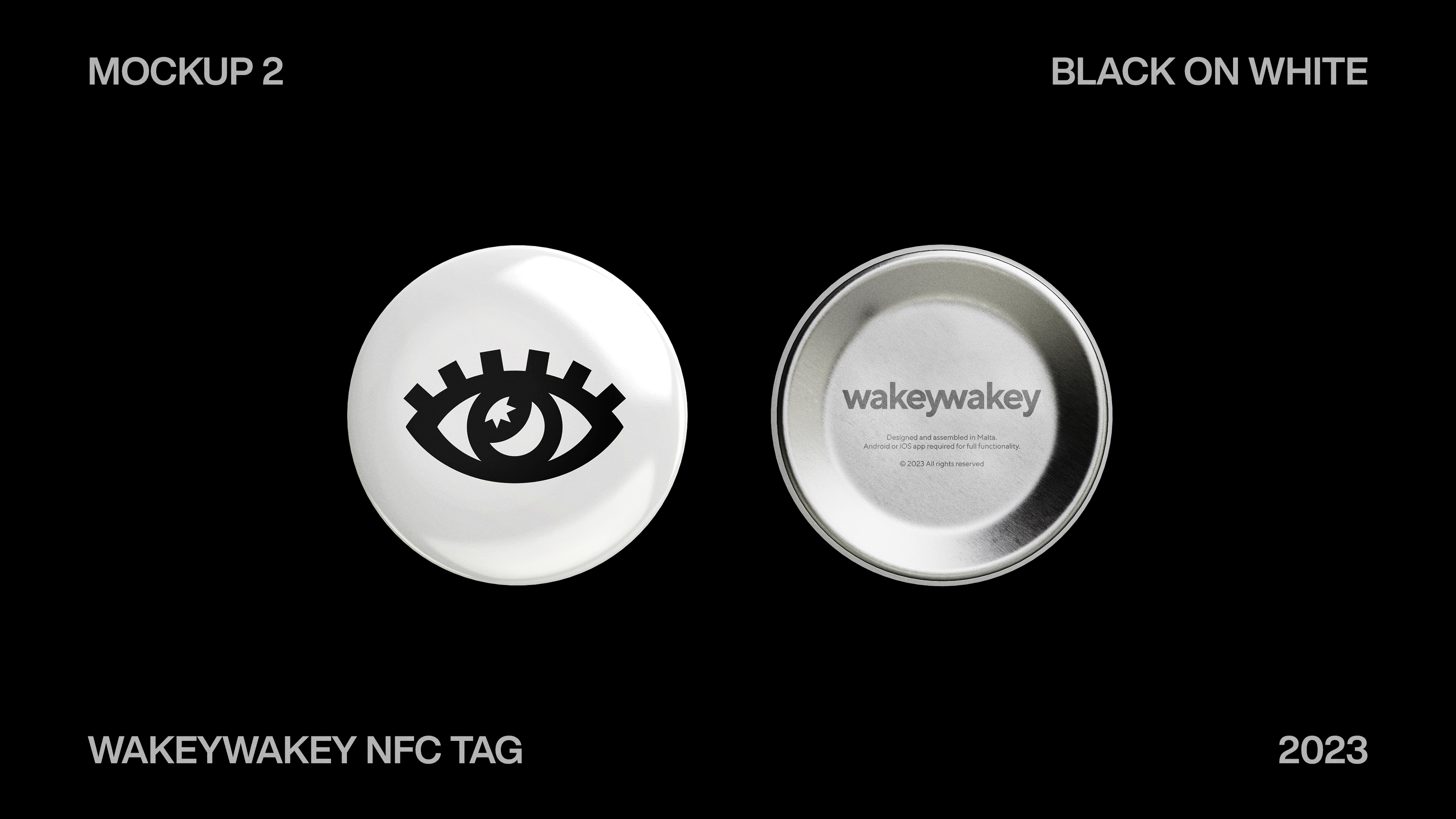
1) The idea for WakeyWakey came from my personal search for a solution to help me get out of bed quicker in the morning. All the apps I tried didn't work, and I figured: why not pair a digital alarm app with a physical NFC tag, requiring me to wake up from bed and tap my phone to a tag (located far from my bed) to turn off my alarm?
After refining this idea, I started designing the logo for WakeyWakey – undoubtedly the most challenging part of the assignment. Getting it right was critical, as its iconography would go on to heavily influence the look and function of all my other design elements.
My intention behind the logo was for it to look playful but not childish, so that it would be able to attract both younger and older adults. I also wanted the eye to feature as a recurrent motif within the brand’s iconography, with a closed eye denoting a ‘sleep’ state, and an open eye denoting a ‘wide-awake’ state. The cornea was intended to hold further symbolism, with the bottom half having the shape of a moon, and the top half being the sun (symbolising sunrise).
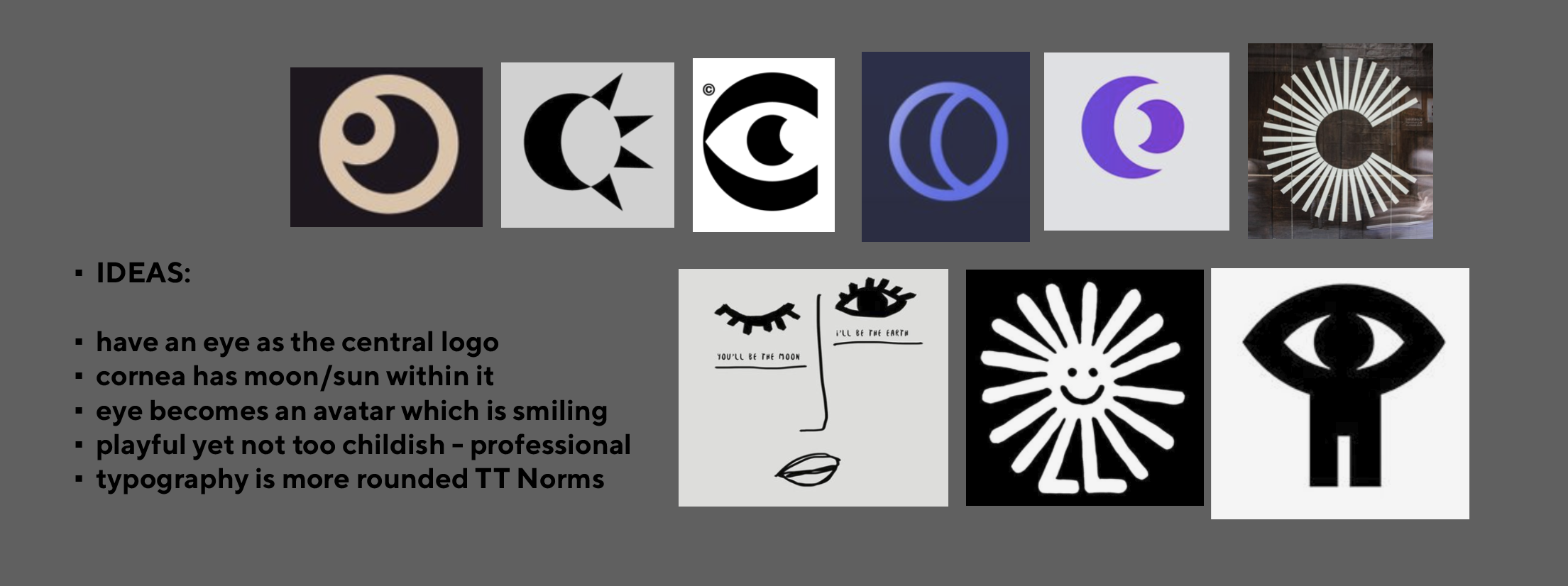
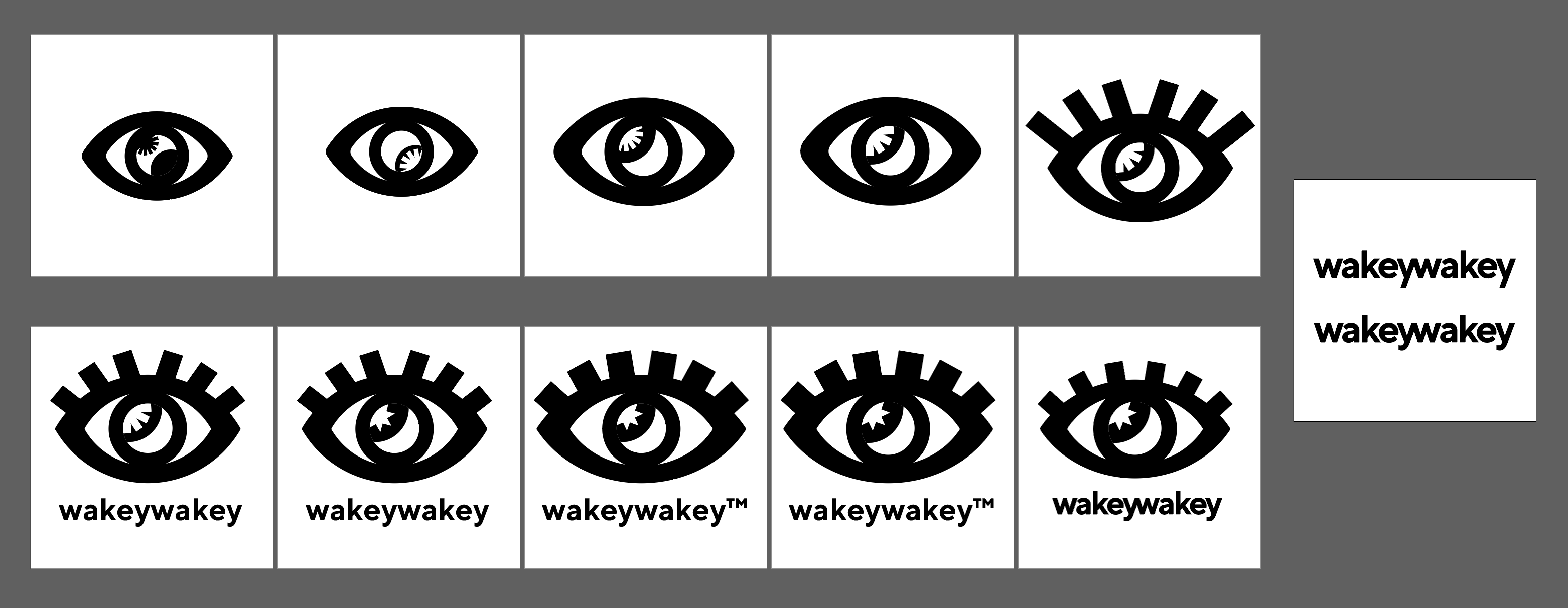
After hashing out what must have been a million different iterations, I arrived to my final result:
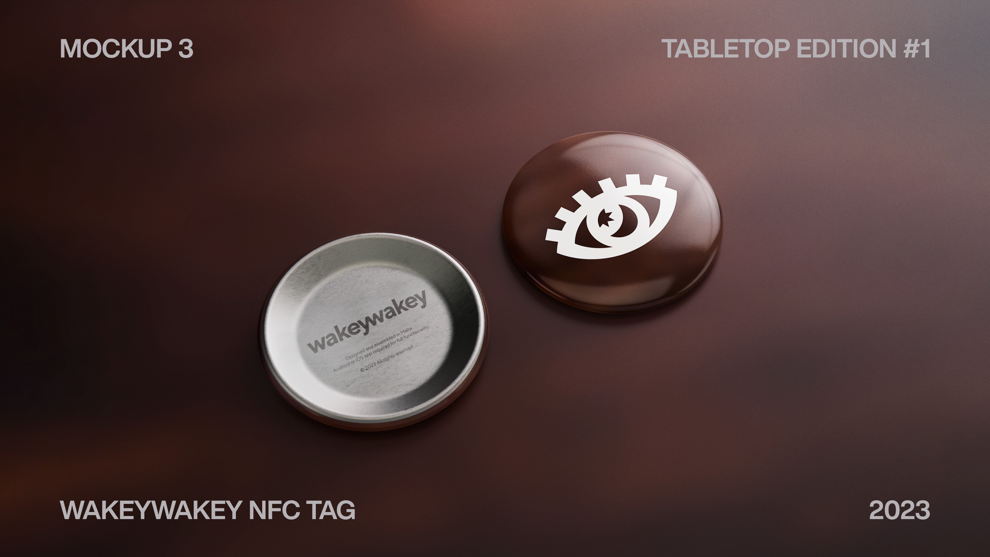
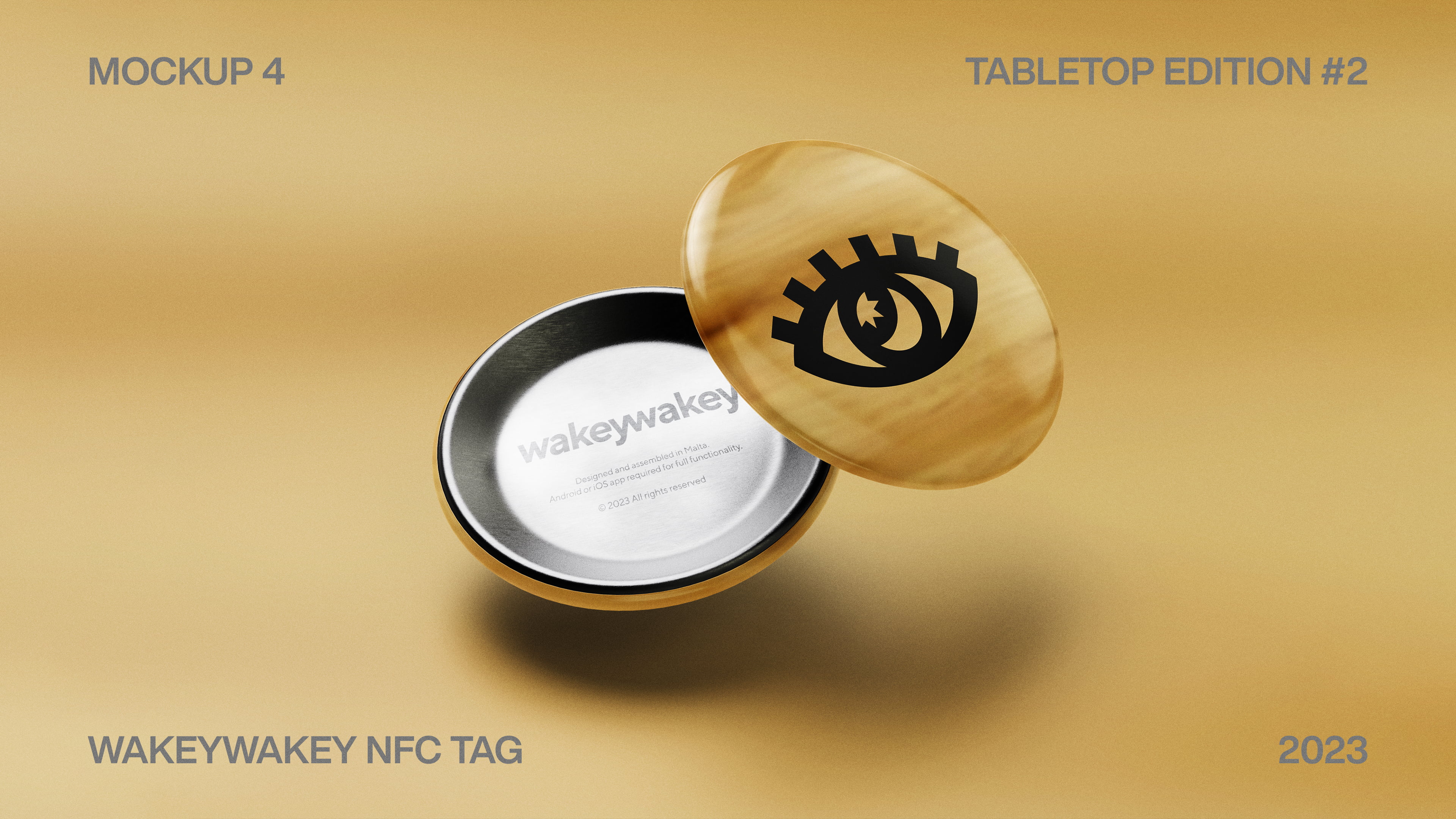
2) Up next came the product design. I needed a minimalist housing for my NFC chip that would strike a balance between being both subtle and eye-catching at the same time. The housing would also need to account for the various household surfaces on which the tag might potentially be placed.
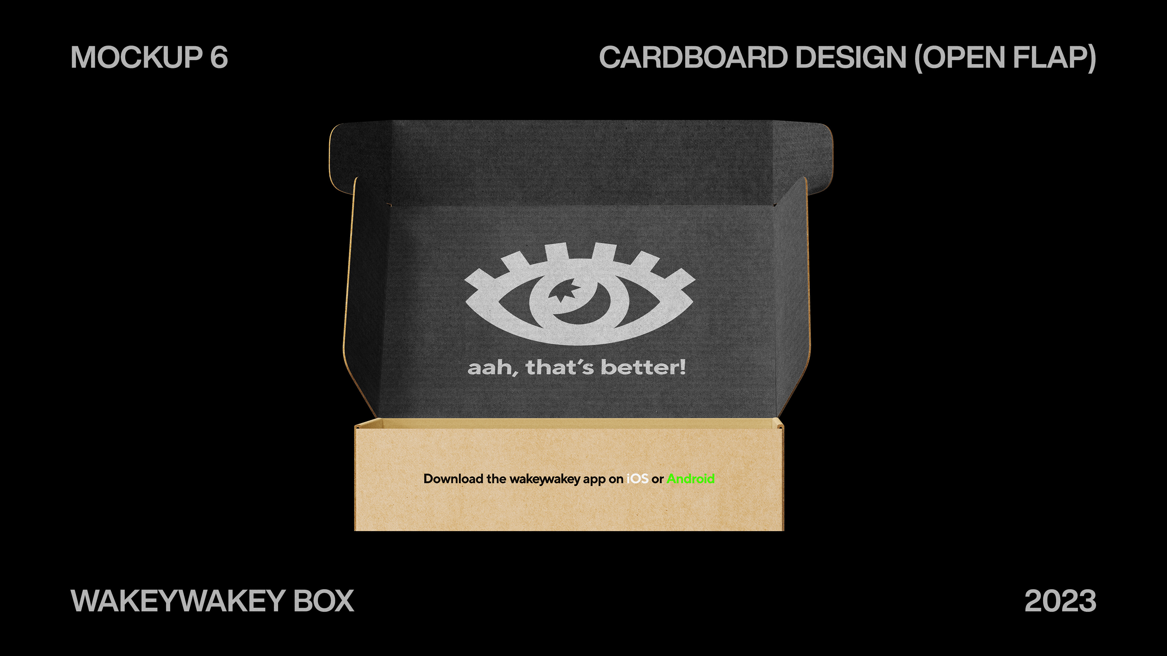
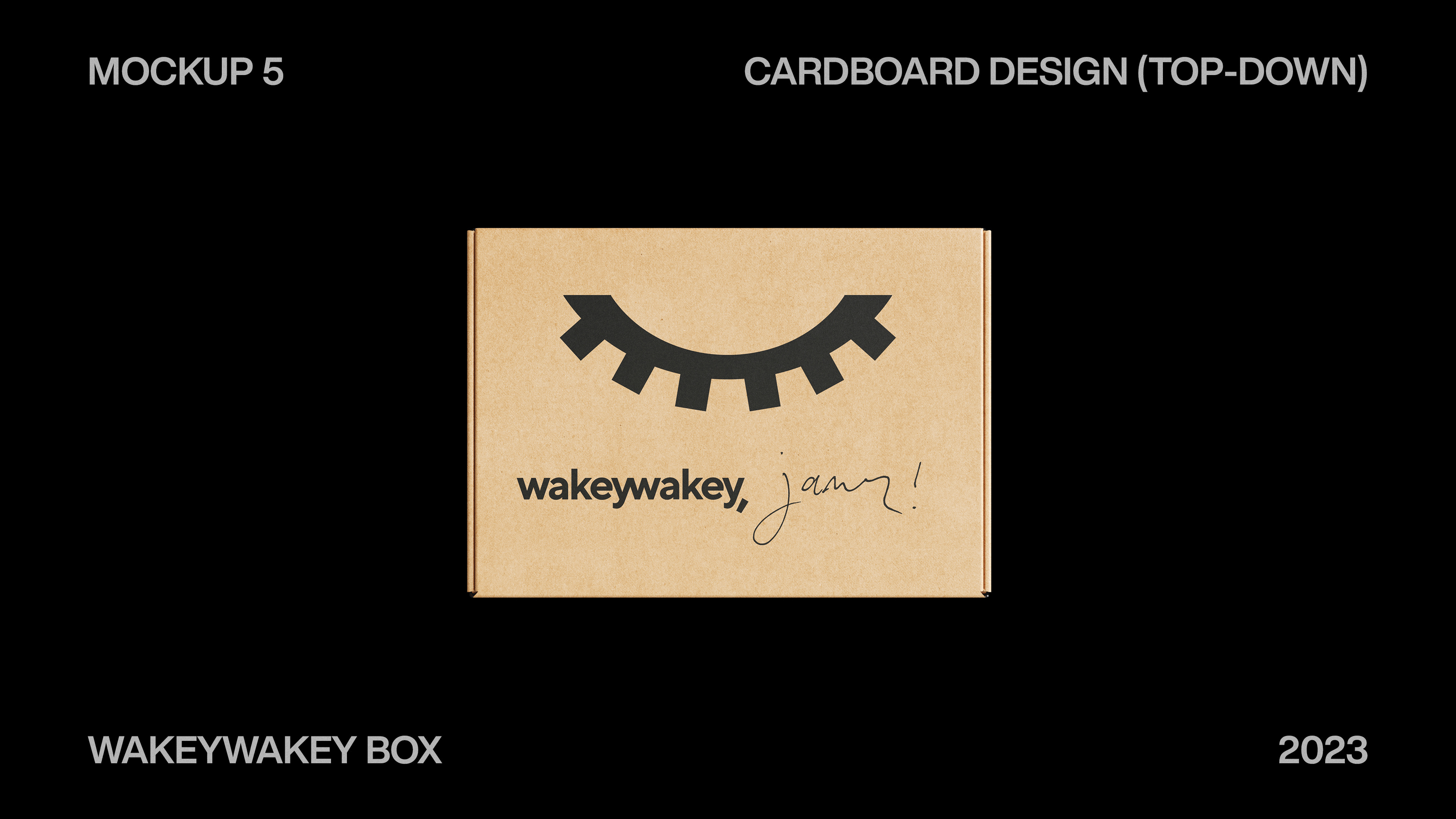
In the end, I decided to re-purpose the timeless glossy button badge to act as a container for the NFC chip, creating some different coloured variants which would closely match most surfaces around the house. I also designed some simple cardboard packaging for the tag, purposely using the logo’s eye iconography to give the customer a pleasant unboxing experience.
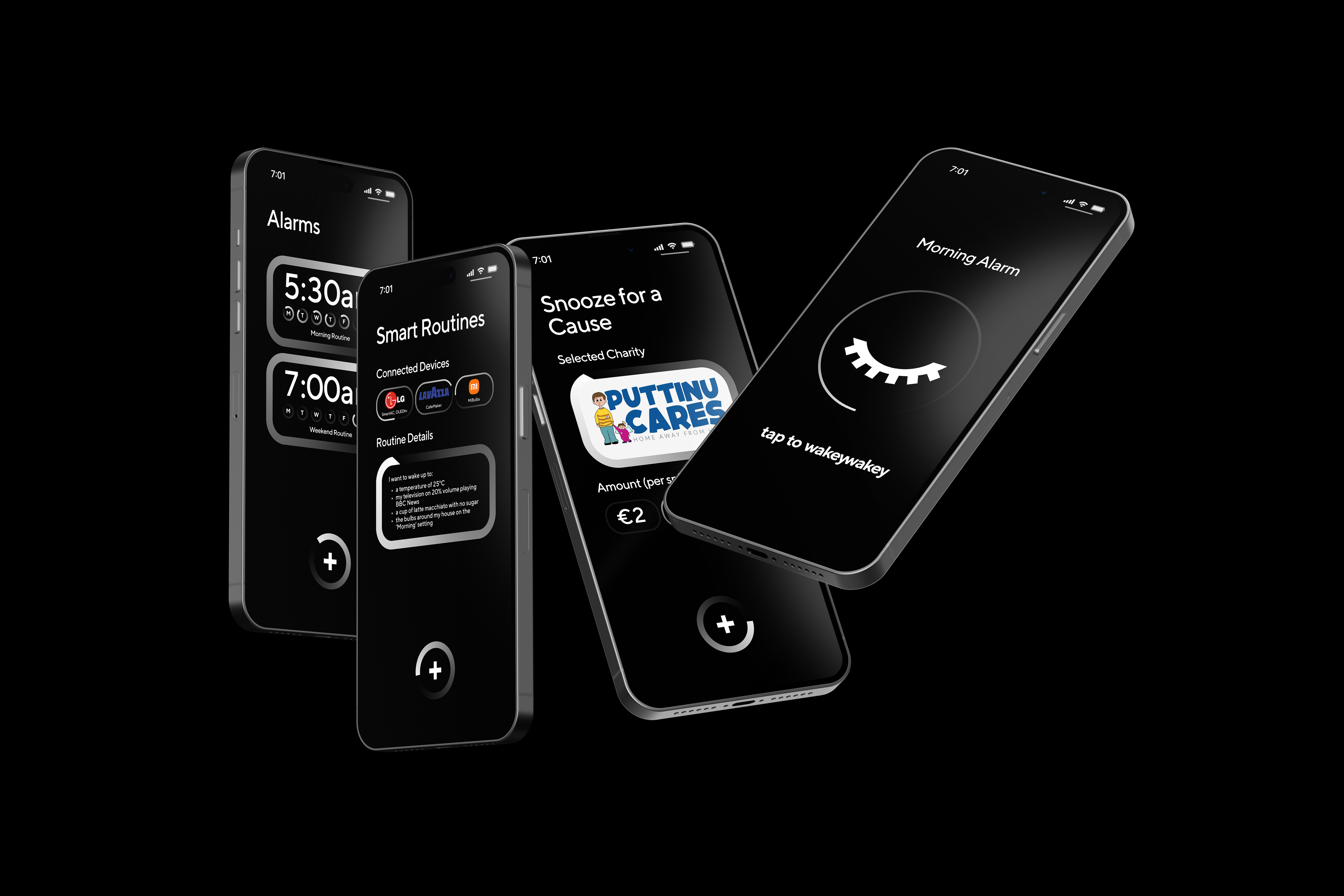
3) All that was left was designing the WakeyWakey app. This part entailed getting creative with the app’s functionality: what could I do to elevate the app further from acting as a simple alarm clock? Some of the features I came up with include:
a) Smart Routine: Linking the app to smart appliances (TVs, light bulbs, coffee makers) that perform specific functions as soon as an alarm is dismissed;
b) Multiple Tags: Functionality for separate smart routines to be programmed in different WakeyWakey tags;
c) Snooze for a Cause: Get 5 more minutes of sleep for a small donation to a charity of your choise.
If only my pillow wasn't so comfortable...
 Freddie Portelli 'Viva Malta' Footage
 Liam Daly Documentary
